Celtic's crocodile-skin monstrosity - why latest strip offering from adidas struck the wrong note

And to top it all, an assurance that, whether you are a player wearing it in the heat of battle or indeed just supporting the team, the new shirt’s "moisture-absorbing AEROREADY technology and breathable mesh inserts will keep you comfortable”. Righty-ho.
The press release accompanying the launch of the "latest green and white hooped adidas x Celtic 2023/24 Home Kit" invited everyone to expect the worst, but that x left floating in the middle of the sentence prompts curiosity. For a start, there should be two more. This new shirt qualifies for a triple XXX horror rating.
What were Celtic thinking?
Advertisement
Hide AdAdvertisement
Hide AdAdidas, usually such a reliable mark of quality, will surely have been stung by the reaction, although they haven’t yet started arguing with supporters, unlike Errea, the makers of the new “orange” Dundee United home kit.
One distinctly unimpressed Arab pointed out on Twitter that they should be at least getting the club’s principal colour right, since they actually play in tangerine.
In addition, the fan noted that United didn’t start playing in tangerine until the late 1960s, which means the blurb about the kit paying homage to the iconic club founded in 1909 didn’t make sense.
Errea, an Italian company, replied somewhat spikily: "Sorry for the two inaccuracies James….we will improve so that everything will be perfect next time thanks to your valuable advice. Congratulations you are a big fan of your club. Do you even like the jersey or did we get that wrong too?”
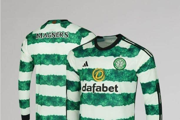

Shirt wars. The fixtures for next season were only announced this morning and already Scottish football is proving box office, with treble winners Celtic having scored an early own goal with the release of a home kit where the famous hoops have been disfigured by a blotting paper/crocodile skin-style effect. There are also three black stripes down the sleeves, and black collar and cuffs. And the yellow dafabet logo ain't helping. Basically, it's a hot mess.
As one unhappy fan posted, the worst there is, the worst there was and the worst there will ever be. The infamous "Ford Peoples" shirt from the early 90s was an eyesore mainly because of the Peoples branding.
There should really be nothing a designer can do to muck up something so pure and simple as a green and white hooped jersey. They only have to avoid a car crash effort for it to be a thing of beauty.
Sadly Adidas have failed in this relatively simple task. As soon as you read that "Elements of the glass pattern from the original entrance to the stadium (have been) included" you know things have become unnecessarily complicated.
Advertisement
Hide AdAdvertisement
Hide AdThere have been plenty of Celtic away kit missteps, where kit suppliers - frustrated by the difficulty to jazz up the home strip - have gone to town on the away one. Another Peoples era top might head the list of worst-ever Celtic kits. You might remember the mint - mint in this case being the colour, certainly not an adjective - offering from 1991-92 with a jaggy mountain range-esque design descending from the right armpit. And that terrible red Ford Peoples logo with the dash of – shock, horror – blue.
It is, of course, now a collectors’ item selling for many hundreds of pounds, which might well be the fate of this latest monstrosity in years to come.
But right now, well, no wonder the dapper Aaron Mooy announced his retirement so abruptly this morning.
Comments
Want to join the conversation? Please or to comment on this article.