Visual art review: Blackadder | McClure | Rae


Elizabeth Blackadder: Etchings and Screen Prints
Glasgow Print Studio
Star rating: * * * *
David McClure: Paintings and Drawings 1952-1963
Cyril Gerber Fine Art, Glasgow
Star rating: * * * *
Barbara Rae: Place and Process
Gateway Galleries, St Andrews
Star rating: * * *
It is not often that you can say an artist is both of those things. They are not the same at all and so popularity can tell against an artist who manages to be both. Indeed, it would be quite wrong to dismiss her as just a painter of cats and flowers and the retrospective held a few years ago to mark her 80th birthday should have dispelled any such erroneous impression. It did not include an extensive selection of her prints, however, although they represent an important part of Blackadder’s achievement. The disciplines of printmaking have proved particularly sympathetic to the wonderful draftsmanship and sense of economy that underlie her art.
She has made prints ever since she worked with the pioneering Edinburgh printers, the Harley brothers, back in the 1950s, but she has worked particularly intensively since she began to collaborate with the Glasgow Print Studio in 1985. Working with them continuously since then, Blackadder has produced more than a hundred prints including etchings, lithographs and screen prints. Now the Print Studio is exhibiting a selection of this work and while not exactly a print retrospective, the show does give some impression of the range and real quality of her work as a printmaker. Japanese Table, the earliest print in the show, dates from 1987. It consists of a pair of compositions of still life objects drawn in simple outline and printed on a single sheet, one in dark green ink, the other in yellow. What is striking about this print is its simplicity and how its lack of adornment allows us to appreciate the quality of the etched line. A more elaborate etching from 1992 shows a boat drawn up on a beach. Here again she uses the etched line in a firm, direct and undecorative way. It is wiry and tough and seems a long way from cats and flowers. But when you do look at the cats and flowers, of which there are a good many, you find, perhaps unexpectedly, the same qualities. Amalia sleeping, for instance, is a black and white etching of a cat sleeping in a rather abandoned pose with its legs in the air. The same toughness in the way it is drawn and the way the drawing is turned into the wiry, almost spiky line of etching makes it anything but coy, cosy or anthropomorphic. It is an independent creature, like a leopard sleeping on a branch, quite indifferent to any human concerns.
Advertisement
Hide AdSilk screen printing is very different from etching. As its name implies it uses screens of colour. Where etching bites and is printed under pressure, silk screen sits on the surface of the paper and Blackadder uses this quality to great effect. In one screen print, for instance, four brightly coloured fish sit on the page, one above the other, the smallest on top. There’s nothing else. It is has the simplicity and impact of a classic Chinese brush painting, but with the added dimension of brilliant colour. Etching can also be coloured, however, and perhaps her most remarkable prints are a series of coloured etchings of orchids. These are botanical, or at least the orchids have their Latin names inscribed in the plate and they are clearly accurate depictions of the plants concerned, but they are a long way from any conventional botanical illustration. Colour is used sparingly, but the way she draws the flowers, exploiting to the full the line of etching, gives them a vivid graphic presence, an almost living character. They are remarkable prints, low-key but memorable.
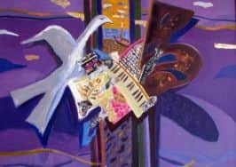
Born in 1926, David McClure is older than Elizabeth Blackadder. As students at Edinburgh College of Art the two were part of a distinguished generation of students of William Gillies, though McClure was also very much influenced by the poetic painting of John Maxwell, who also taught there. David McClure: Paintings and Drawings 1952-1963 at the Compass Gallery is a collection of work from the first decade of his career. There are a number of characteristic paintings. One called The Ritualists II, for instance, is a fantasy with a haloed saint at its centre, flanked by a bishop, a woman who might have strayed from a painting by Picasso and various birds and flowers, all painted in rich dark colour and heavy impasto. Two comic doodles of a bishop, evidently done in an idle moment, suggest that the figures are no more than an occasion for a capriccio on a religious theme and that there was no other intention than to make an intriguing image. Nevertheless, McClure is best when most direct. Bamboo Fence, Sicily, for instance, is a painting of olive trees through the screen of a broken bamboo fence. Rich in colour and evocative in atmosphere, it looks back to Bonnard and Van Gogh.
The main part of this show, however, is a collection of works on paper done in the 1950s, when McClure went to Italy and as far south as Sicily, but also spent time at Millport in Great Cumbrae. He had a rare gift as a draughtsman, not only as a master of line, which is what we think of as the principal constituent of good drawing, but also of tone. Houses and Walls, Millport, for example, is a charcoal drawing. No more glamorous than its title suggests, it is just a view of houses, stone walls and a telephone pole in plain black and white, but the tone of everything is so beautifully observed that you almost think you are seeing colour. There is the same subtlety in his drawings in ink and wash, while a line drawing of a jug of flowers is sharply observed yet also freely drawn, and you can clearly see the common ground he shared with Blackadder. Their generation took for granted this command of drawing, but now that it is no longer the backbone of teaching, future generations will struggle to match it.
Blackadder is one of only two artists resident in Scotland who are members of the Royal Academy in London. Barbara Rae is the other and she is currently having a small show at the University of St Andrews. The university did have a very good gallery, but, short-sightedly, closed it down. Inevitably, they still need an exhibition space, but for all the success and prosperity of the institution, all it has is a cramped space off the canteen in its modern North Haugh Campus. It has a distinctly corporate feel to it and this does affect the art. Rae’s show consists mainly of screen prints, etchings and monotypes, but with a handful of related works. Her prints are very different from Blackadder’s. She uses breadth and rich colour where Blackadder uses precision and economy, but they evoke the broad and sunny landscapes that are her subject. Drawings in her sketchbooks show the kind of observation that is her starting point. The show also includes a tapestry based on Fishpool-Lacken, a monotype which hangs beside it. It is a bold and simple composition of bands of dark blue and red gold. It is too crowded here. The richness of Rae’s colour demands a more austere, less glossy environment. It is time St Andrews thought again about its gallery.
• Elizabeth Blackadder until 5 October; David McClure until 4 October; Barbara Rae until 13 December