Art reviews: INK: Public Archive | New Contemporaries


INK: Public Archive – Five Decades of Printmaking at the Glasgow Print Studio ****
Glasgow Print Studio
New Contemporaries ****
RSA, Edinburgh
If the Scottish Arts Council, the precursor to Creative Scotland, were to have a memorial, one achievement that could with honour be inscribed upon it would be the part that it played in establishing Scotland’s printmaking workshops. They have proved an enduring and fertile addition to the art life of the country. Edinburgh Printmakers’ Workshop was the first, launched with the assistance of a modest grant of just £500 from the SAC in 1967. Glasgow Print Studio followed five years later in 1972. A little confusingly, however, Glasgow is now staging a 50th anniversary exhibition, INK: Public Archive - Five Decades of Printmaking at the Glasgow Print Studio. By my maths, there may have been five decades of printmaking in Edinburgh, but there have only been four and a half in Glasgow. Maybe you don’t need to be good at maths to be good at printmaking. I would hate to think, however, that this was a post-truth assertion of Glasgow’s priority.
Advertisement
Hide AdAdvertisement
Hide AdWhatever, Glasgow certainly has a distinguished record. Since the 1990s, too, it has built up an archive collection and this show has been selected from it by Sam Ainslie, Sandy Moffat and David Harding, three individuals who as teachers contributed so much to Glasgow School of Art’s success.
In any story of Scottish print-making, whether in Edinburgh or Glasgow, a place of honour must be reserved for Philip Reeves. He was involved in the initiative that created the Edinburgh workshop and then later too in the creation of its Glasgow sibling and he has made wonderful prints there ever since. He is still a star here, represented by two characteristically lovely works, Cliff Edge and Bridge. Etching is an intaglio or relief process and Reeves has always been adventurous in the way he exploits this. Cliff Edge depends on contrasts of surface while Bridge is composed from multiple plates whose arrangement suggests the bridge of the title. Each one is distinct as a building block, but then this simple composition is lifted fully into a third dimension by soaring blue against buff paper.
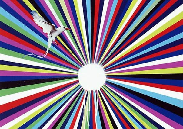
John Byrne was also in from the start. He is represented here by Girl with Monkey, dating from the year it all began, 1972. It is a characteristically unsettling work as the girl seems to be at once both child and adult. Strictly speaking, however, this is not by John Byrne but by Patrick, his alter ego, whose signature it bears. Alasdair Gray is another veteran. The title page of Lanark realised as a lithograph shows how seamlessly his writing and his art are interwoven. Two sombre and impressive Ossian prints by Calum Mackenzie, sometime director of the Print Studio, also date from the early years, while the present studio director, John MacKechnie shows how long he has been involved with a coloured etching of goldfish in a pond from 1983. It echoes Elizabeth Blackadder’s work. She, too, has had a longstanding relationship with the Print Studio and is represented here by a beautiful print from her orchid series. The late Bet Low, represented by a beautiful screen print titled Lennox Woods, is perhaps the senior here, but the next generation are also well represented. Steven Campbell made prints here from the very beginning of his career. Natural Follies at Bee Junction is a big and powerful etching from 1982, the moment of his breakthrough. Some of Peter Howson’s best work is in his prints from those early years. The comic book melodrama of the Lonely Hero, a big woodcut made in two parts, is redeemed by the roughness of his technique. Print has always been an important medium for Ken Currie and he is represented by an etched crowd of heads from 1992, reminiscent of the dark expressionism of Otto Dix. Not everything is figurative or representational, however. Smiling Again is a bold abstraction by Hock-Aun Teh, while Sun Visor is an aptly named dazzle piece by Jim Lambie. David Bellingham makes a pun on the words “inch” and “centimetre.” Written on his print they swap roles. “Inch” measures a centimetre and “centimetre” measures an inch.
If INK is largely the work of veterans, in Edinburgh the RSA’s New Contemporaries show gives us a taste of the future. If our horizons seem dark, in art at least there is brightness here. Chosen from the degree shows of the five Scottish art schools, there are 58 participants over the two floors of the RSA, including a small group of architects.
Tamara Richardson sets the scene with a dramatic intervention at the entrance. Sheets of glossy transparent plastic hanging from floor to ceiling create strange watery reflections and distortions. Nearby Megan Hampton has created a ruinscape with scattered elements of classical architecture. Beyond, Claire Connor gives us a very different take on reality with phonetically transcribed fragments of colloquial Scots in all its pithy glory. Felix Carr won the Steven Campbell medal at Glasgow School of Art and something of Campbell’s spirit lives on in his six large canvasses, three black and white and three coloured, all covered in explosive fragments of drawing that veer between the figurative and the abstract. There is an echo of Campbell in Camille Bernard’s work too. Multi-dimensional, it combines painting with sound and film in an intriguing way.
Two dark canvasses by Daphne Percy-Chorafa with piled up heads lurking in the shadows are equally impressive. There are also some beautiful, but more modest works. Emily Stewart collects portraits on her phone and then turns them into delicate small paintings. Frances Rhoklin makes woodcuts. They are simple and effective, but, lacking any other outlet for her printmaking, she has made her own press out of plywood and a rolling pin and it is also on view.
Hers is one of the quieter voices. Others do shout louder. A large
Advertisement
Hide AdAdvertisement
Hide Adthree-part figure by Jack O’Flynn is one of the dominant pieces in the large gallery. Assembled out of plaster, paint and found objects, the surreal linked figures recall Miró, while collaged broken china even echoes Miró’s great hero Gaudí. Blake Venus closes off the corner of a gallery for a strange assemblage of images and objects with vacuum packed apples scattered over the floor. There is a slight flavour of
Jeff Koons about the imagery, but
that seems to be at odds with her declared intention to reclaim her “spirituality and existential individuality from the insidious persuasion of corporate bodies.” Koons generally does the opposite, however. All the works are accompanied by statements like this. Some are even more bizarre. Words, I fear, are not always an artist’s best friend. Kristian Jack Thomassen does use them successfully, however, in a set of screen prints, but they persuade by the old fashioned skill of beautiful graphic design. Harmony Bury’s work is among the most memorable for the sheer discomfort of it. Lips stuck with splinters of glass, arms covered in thorns recall the limbs of the tortured Christ in Grunewald’s Isenheim Altarpiece – a strange throwback to find here, or perhaps a chilling portent for our times. ■
*INK until 26 March; RSA New Contemporaries until 15 March