Art review: True To Life: British Realist Painting in the 1920s and 1930s at the Scottish National Gallery of Modern Art, Edinburgh


True To Life: British Realist Painting in the 1920s and 1930s Scottish National Gallery of Modern Art, Edinburgh *****
We have a very deterministic view of art history: whatever ultimately prevailed was always inevitable. Those artists who resisted what became the mainstream, or who simply saw things differently, were anachronisms to be put to one side in our history books. According to this view it was, for instance, slightly absurd to go on building Gothic churches in the 16th century when the Renaissance was already under way. If contemporaries had really thought Gothic old hat, however, we would never have had the glory of King’s College Chapel. It is absurd to select with hindsight like this, but another good example is the way we treat British art in the first part of the 20th century. The march of modernism was irresistible and those who resisted it are now justly forgotten, we say, but, if that is so, why did so many artists resist it? True to Life explores this art of resistance, or perhaps it was persistence, and presents a widely popular, but now largely forgotten kind of painting that was very much of its time, but nevertheless set its face firmly against the new styles coming out of France. That at least is the story and there was plenty of xenophobia (proto-Brexit?) to support it. In 1925 for instance, the President of the RA, Sir Frank Dicksee, told the students at prize-giving that “they of the British race must not consent to be dragged behind the heels of Continental decadents.”
Advertisement
Hide AdAdvertisement
Hide AdArtists were not all so hostile, however. In Resting Acrobats, for instance, Glyn Philpot painted sad circus people in pink costumes in direct homage to Picasso, though being British, Philpot’s athletes do look rather better fed. Although he did so entirely on his own terms, Stanley Spencer embraced cubism directly in his two paintings St Veronica Unmasking Christ and Christ Overturning the Money Changers’ Tables. While the steep space of his later Adoration of Old Men (an improbably weird scene of young ladies fainting with lust at the sight of a crowd of unlovely, bearded old farts) is also entirely dependent on cubist composition. Winifred Knight’s The Deluge is a Vorticist picture, while Frank Runacre’s Untitled (Ruins) is a Cubist still life.
Surrealism too finds significant echoes in True To Life, but that is no surprise. The high finish favoured by Dalí, for instance, was entirely in tune with the sharply defined drawing and still, flat surfaces seen in so many works here. Algernon Newton’s Outskirts of Cheltenham also approaches the dream-like stillness of Magritte. Nothing overtly surreal disrupts its ordinariness, but the mood is intense all the same. James Cowie really was a surrealist, however. As his Portrait Group here demonstrates, he saw clearly the way that the prevailing graphic style of painting opened towards the dreamlike and surreal. Edward Burra’s strangely grotesque Snack Bar is all on its own, however, somewhere between surrealism and Georg Grosz. Brilliant though it is, it is hard to see quite where it fits the realist label. At the other extreme that also includes Fortunio Matania’s Blackpool, a workaday piece of commercial art in a style that was perpetuated in Ladybird Books. Harold Williamson’s Picnic leans the same way.
This inconsistency towards new trends is a problem that the exhibition does not quite resolve. Its subtitle is British Realist Painting in the 1920s and 1930s. As the catalogue acknowledges, however, realism can be many things. Impressionism, for example, was in one sense the most realist style ever, yet Impressionist is the one thing almost all these artists are not. Indeed you could say, rather than realism as their unifying factor, it is their near universal rejection of Impressionism that unites them, but even here the show is not entirely consistent. The realism of David Jagger’s painting, The Conscientious Objector, a strongly lit portrait of a man in a dark hat and pink scarf, verges on the impressionist.
Art in Victorian Britain was a bigger and richer economy than it had ever been before. Artists had reputations like modern pop stars and their art penetrated popular culture as deeply. It is not surprising that artists in the immediately succeeding generations were not prepared to turn their back on formulae that had brought such success and indeed as late as 1939, Charles Spencelayh’s Why War? is still essentially a Victorian morality picture. My anonymous predecessor in The Scotsman put his finger on this continuity. Writing about Meredith Frampton’s glassy study of a girl playing patience he/she wrote, evidently without sarcasm, “Since Lord Leighton died, surely no Englishman has painted in a way so learned and so deadly smooth? This is an extraordinary achievement.”
The influence from the 19th century of the Pre-Raphaelites is also especially marked. The austere drawing and lack of either depth or marked chiaroscuro in Dod Procter’s, to modern eyes rather uneasy, Little Sister, Lancelot Glasson’s evidently wildly popular, The Young Rower, Sir Thomas Monnington’s The Wine Press, Pamela Bianco’s Self-Portrait (even with a Quattrocento hairstyle), or John Downton’s beautifully drawn, frowning schoolgirl, Nora Russell, all show how the Pre-Raphaelites’ admiration for the early Italian painters also endured. That being so, it is a shame that James Cowie’s Falling Leaves is not included. A beautiful tribute to the Pre-Raphaelites, it would eloquently have encapsulated the distinctive mix of continuity and modernity that gives so much of this work its character.
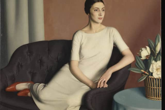
But Cowie’s austere draughtsmanship and restrained style of painting, like that of Meredith Frampton’s, not only in his glacial A Game of Patience, but also in his less icy Woman Reclining, are a long way from the glamour of Gerald Brockhurst’s Dorette, the signature painting for the exhibition, or his even more sultry By the Hills. He too cites the Quattrocento, and indeed the Mona Lisa, in the way he paints his figures, bust-length against a shadowy landscape, but the question that was asked of Brockhurst’s painting of Dorette’s glossy lips, “Does he use real lipstick?” suggests how his apparent restraint is only a way of winding up the sexiness. Not Quattrocento at all.
James McIntosh Patrick’s early landscapes have a well earned place here, but as this show does originate in Scotland, although there are a number of other Scots, there are also several notable omissions. John Duncan was an expert in tempera, the favoured medium of some of these artists. His pupils Cecile Walton and Eric Robertson would fit very well here too. There are a few prints included, so Ian Fleming’s engraving of Gethsemane, a modern dress religious subject, would fit well with similar images in the show. Likewise William Wilson’s St Monans, an essay in spiritual modernity, is one of the finest etchings of the time, but it is not here. Equally, while Alberto Morrocco’s beautiful early Still Life with Plaster Bust, painted in the style of his teacher James Cowie’s surrealism, is a welcome inclusion, Morrocco also worked with Robert Sivell on murals for Aberdeen University Union. They are absolutely typical of the period as it is presented here. Sivell should have been included.
Advertisement
Hide AdAdvertisement
Hide AdThis show is full of beautiful things. It is a delight to see them given back their place and the National Gallery is to be congratulated on its initiative. However, except for the time-frame in which they all belong, more or less, and in spite of the “realism” in the title, they are defined rather by what they aren’t than by what they are, ranging as they do from the purely academic, and so perhaps not altogether unjustly forgotten, to the truly imaginative and original.
Until 29 October