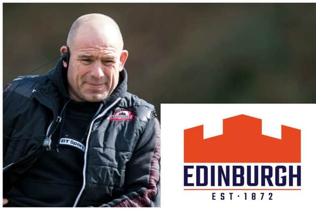
Fans react to Edinburgh Rugby's revamped badge and colours
Fans weren’t too enamoured of the changes, with most comments on social media slating the new colour scheme and badge overhaul. We’ve picked out a selection of comments as supporters reated to the news:
Clark Gillies wrote: “Horrible! Looks like a mortgage/financial advisory company logo.”
Advertisement
Hide AdAdvertisement
Hide AdScott Spalding tweeted: “It’s like a construction company logo and I prefer the gunners brand logo.”

Ross Hunter added: “Hope this is a joke! It’s ridiculous! No need to change and the new design isn’t good! Does this mean we are changing our colours as well? Slap in the face for those of us that have followed the club for years!”
Another fan wanted to know: “Is this a wind-up?”
Flora Johnston said: “New badge, new identity maybe, but new colours?! Bought my son a ‘Black and red army’ t-shirt from your shop for his birthday last week. Really not impressed.”
Lee Mullen reckons the new badge “looks corporate” while Niven Rennie branded it “truly awful”.
Leann McOmish offered her thoughts: “Ummm... Looks far too corporate... like a logo for a financial advisor.”
Eluzabeth Cockburn wasn’t impressed: “Very bland. Looks like it was designed by a committee. Suspect they may have paid a lot of money for it. Should have run a children’s competition - might have got more imaginative results!”
Ray Carson added: “Says Lego to me!” with a thumbs-down emoji while Charles Mullins simply wrote: “Awful.”
Advertisement
Hide AdAdvertisement
Hide AdDonald Bathgate tweeted: “Why?” while Jamie Brayton Nixon wrote: “Better than the last few efforts but still not great.”
One fan going by “Luke” wrote: “Looks like a knock-up they’ve had to do for a Rugby Challenge game because they couldn’t get the Pro14 license.”
Another supporter wanted to know: “Can you get your money back for the logo?” but it wasn’t all doom and gloom.
Andy Jones declared he was “loving the new logo” while Callum Swan said: “I like it.”
@ItsMikeys on Twitter wrote: “I think it’s good. They desperately needed something ever since they lost the Gunners title. Although blue, white and orange?! Macron will have a field day.”
Final word to Alan Barnett, who simply wrote: “Meh.”