Dundee United reveal new look - but only eagle-eyed supporters may notice

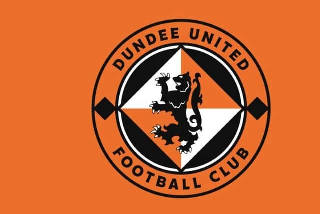
The new logo, aimed to “allow the visual identity of the club to become more modern, clear and consistent” is similar to the Tangerines’ existing lion crest but with subtle, modernised differences.
A new font, and alignment of the team name that borders the emblem has been created, while the most obvious change is the contrasting orange and white panels have been swapped.
Advertisement
Hide AdAdvertisement
Hide AdSome exact detailing has also been carried out on sharpening lion image itself and refining alignments with United showing the subtle changes in an overlayed image on the website.
Communications director Joe Rice said: "The team at Creative Graffix have put a lot of hard work and expertise into this project. The aim for us as a club was to modernise the look and feel of the club brand and digital strategy for the future while retaining the core values of our history.”
United's badge has been in place for almost three decades, but the changes at Tannadice are not unusual for modern-times. Rebranding, and re-designing club crests has become a more frequent occurrence for clubs in recent years with more graphics packages available and more frequent use of emblems, motifs and branding online.
Rangers followed a similar path two years ago, retaining the lion rampant and football crest of the club, but modernising the look with a digital-friendly font created and, like United, centering the wrapped word surround to make the branding easier to read.
Recognisable branding is often at the forefront of such decisions, but so too is history and logos are one of the facets of a football club fans find affinity with and hold dear with importance.

Falkirk rebranded earlier this century, dropping the football club and 'Est. 1876’ dateline with a modernisation aim that the club also stood for the community as well as the team. Fans have, however, hankered after a return of the Est.1876 since with retro gear from better times popular amongst Bairns fans.
Hibs went one step further at the turn of the century and redeveloped their club crest for a fourth time in line with supporters’ wishes, combining the original harp, ship of Leith, Edinburgh Castle, and a football to represent the club’s roots on its 125th anniversary.
Crests, though affectionately held or valuable business branding are also controversial subjects legally too. Hibs had previously been forced into a change in the early-1990s after the Lord Lyon identified their use of the crown was without permission. Likewise Ayr United and Airdrie have both been among those to have fallen foul of the Lyon Court, Scotland’s oldest, within the past decade over their use of the saltire or shield shapes within their team badges. Highland League Formartine United were forced into a crest change in 2012.
Advertisement
Hide AdAdvertisement
Hide AdAncient laws, dating back to the 16th century, prohibit letters or numbers forming part of the ‘heraldic shield’ with other requirements over castle-like turrets or town’s coat of arms.
The most recent badge change in Scottish football – another mired in controversy – was just a couple of weeks ago when FC Edinburgh emerged with a new name and new logo for Edinburgh City’s League One campaign next term.
Comments
Want to join the conversation? Please or to comment on this article.