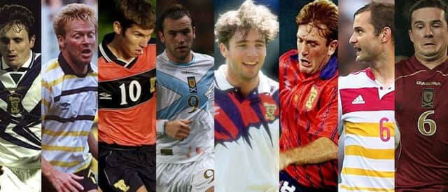
Eight of the worst Scotland football kits


Although there has been a positive response to the tartan home kit, which bears more than a passing resemblance to the Euro 96 effort, the fluorescent pink change kit has sent many fans into meltdown.
Here’s a look at eight other controversial shirts...
‘COSTA RICA’ KIT, 1990: It’s Italia ‘90 and the Tartan Army travel with hope that Scotland can finally break the group stage hoodoo under the leadership of Andy Roxburgh. But in Genoa, the team take to the pitch not in their iconic dark blue, but in horizontal yellow stripes – and they are left horizontal after 90 minutes of hell against Costa Rica, who are wearing red. The strip got ditched after the World Cup but, sadly, the fashion blunders continued.
Advertisement
Hide AdAdvertisement
Hide Ad‘THE SLASHER’ KIT, 1991-1993: Scotland appeared as the only football team ever to take to the field wearing a strip that was apparently inspired by a grisly murder victim. There was even a matching “blood” patch on the left side of the shorts, which were purple or occasionally white. This “slashed” appearance lasted two years between 1991 and 1993 and could best be described as ‘abstract’.
‘BUBBLEGUM PINSTRIPE’ KIT, 1993-1995: Imagine the meeting where they came up with this: “Okay lads, we need a new strip to get away from the fatalism of the last effort. We need something that the fans will want to buy, the players will have pride pulling on and our enemies will fear the sight of. Any ideas?” “...bubblegum pinstripe?” “Sounds perfect!” Scotland wore this change kit when they were defeated 3-1 in Italy, the loss in Rome confirming that Scotland would miss out on the World Cup for the first time in 20 years.
‘LIGHTNING’ KIT, 1995-1996: Had this design appeared five years later, it would have been assumed that the inspiration came from those weird screensavers that used to come with the original Windows computers. Scotland actually travelled to Euro 96’ with this as the second kit. Thankfully we were able to wear the tartan blue effort for all three group ties before heading back north, saving us from further embarrassment.
‘SALMON PINK KIT’, 1999-2000: A more muted pink than the pinstripe effort, the change kit worn at the turn of the millennium at least featured recognisable navy blue trim, navy blue shorts and navy blue socks, but it was still pink. However, it was worn during a shock 1-0 win over Germany in 1999, with Billy Dodds and Don Hutchison combining for the only goal of the game. Halcyon days, eh?
‘HEARTS’ KIT, 2008-2009: Intensely disliked by anyone outside a two-miles radius of Gorgie, Larbert or Arbroath, Scotland only wore this away strip once, with disastrous results. In a campaign where our brave heroes managed to defeat France (twice) and Ukraine, they saved their worst performance for a 2-0 away defeat to Georgia late on. Described somewhat curiously as ‘cherry red’, the Diadora-made kit also came with yellow trim. And white trim. And a weird design on the chest. Ditched in favour of a predominantly white shirt with pinstripes, and navy and sky blue trim, which no one remembers thanks to the maroon monstrosity.
‘SALTIRE’ KIT, 2008-2009: Not content with the symbol appearing in the crest, we then decided to emblazon the saltire right across the chest of each player. A forced attempt at patriotism it may be, and it was the strip that James McFadden wore when he scored that wonder goal in the Parc des Princes so it shall always invoke happy memories for us Scots. But in fashion terms, it looked more like the sort of shirt seen hanging outside shops on the Royal Mile blaring ceilidh music. Other memorable kits from the Diadora era include the sky blue away kit that couldn’t be worn against teams in dark blue (just like the home kit then) and that amber effort with the wee dots on the shoulder that supposedly changed colour according to the player’s body temperature.
‘REFRESHERS KIT’, 2014-2015: The worst part of the kit was that it replaced a strip which had generally been well-received. For two years or so, the national team wore dark blue shirts with white collars, and a ‘jaquard’ Saltire on the chest; white shorts with blue trim and red socks. Launched in the aftermath of Scotland’s failutre to qualify for Euro 2012, the away kit was essentially a reverse of the home kit - white shirts with blue piping, blue shorts, and blue and white socks. The purists were thrilled, it wasn’t pink and there were no designs on it resembling Pop Art.
Then in 2014, in an ill-judged nod to history, we were treated to the Lord Rosebery kit. Prime minister of the UK between 1894 and 1895 (some Scotland kits have lasted longer), Rosebery had a great interest in football and horse racing and became Honorary President of the Scottish Football Assocation, leading to Scotland occasionally playing in the Lord’s racing colours of primrose and pink.
Advertisement
Hide AdAdvertisement
Hide AdIt was worn during a 4-1 win over England in 1900, but its reincarnation in 2014 was a worse miss than Chris Iwelumo against Norway in 2008. Predominantly white shirts had one pink and four yellow horizontal bars, along with a pink collar and pink detail on the sleeves. The white shorts had pink stripes down the side and the socks looked like they’d been borrowed from Ronald McDonald, all pink and yellow hoops and the word ‘Alba’ emblazoned in - you guessed it - pink, on the front.
SEE ALSO