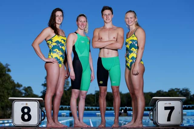
Australia swim kit ‘draws attention to crotch’


Australian fashionistas have slammed their national team’s new swimming kit for drawing attention to the “crotch” area.
They also branded a bold new print in the country’s official colours “confusing”.
Advertisement
Hide AdAdvertisement
Hide AdWetsuit-style outfits to be worn by both men and women have been singled out as particularly unbecoming and guiding the eye “to the wrong place”.
The new designs were unveiled yesterday by the Australian sportswear giant Speedo.
One features a print made up of kangaroos, emus and Australian maps in green and gold.
The other is a bright green knee-length suit with a contrasting black leg.
“My main issue is with the green and black suits and the emphasis on the crotch,” said Brisbane stylist Di Cant. “The shaping in the crotch and with the black leg, something is not quite flattering.
“It is drawing the eye to the wrong place, rather than to the athletic body and the overall look.”
Mark Ferguson, a director of Australian men’s tailoring firm Wil Valor, said: “It looks like they have tried too hard. They have tried to be ‘out there’ and different, and it has not paid off.”
But Mr Ferguson especially disliked the garish print featured on the swimsuits, which bears a similarity to the kangaroo motif dreamed up for the 1986 Edinburgh games.
Advertisement
Hide AdAdvertisement
Hide Ad“I don’t like it at all. It’s a really busy pattern – you don’t know where to look,” he said. “It looks incomplete.”
Ms Cant agreed. “I think it is terribly obvious, with kangaroos and the map of Australia.”
However, the Aussie swimmers who modelled the costumes at the launch complimented the racewear.
“Yeah, really happy. They’re basic and sort of the same as we’ve had for the last year or so,” said freestyler Bronte Barratt. “The colours seem good. They’re majority green instead of majority black, which is really good because that represents Australia. We have the gold cap as well so it will look great.”
Melanie Schlanger posted a photo on Twitter and the message: “Vintage print and bright colours. Love it!”
Ruth Walker, editor in chief at Scottish online fashion magazine Crave, has described the dispute as “a stooshie over nothing”.
She said: “I’m ambivalent with regards to the specific style. Swimwear is there to serve a purpose: namely to get the athlete through the water as swiftly and efficiently as possible.
“My attention is drawn not to the V-shape mapped out in green and black, but the strength of those shoulders as they power through the pool.”
Advertisement
Hide AdAdvertisement
Hide AdBut she echoed Mr Ferguson’s sentiment about the women’s swimsuit. “Stopping the pattern just above the bust draws attention to their broad shoulders while flattening the chest,” she said.
“I’d prefer to see the legs cut higher and more substantial straps – those skinny things say ‘beach’ not ‘world-beating athlete’ to me. But that retro print – I rather like it.”