Uist's MacMillan Spirits employ Minneapolis-based artist to design their whisky, gin and rum labels


There has been a trend in recent years for neutral drinks labels.
Think of Scottish brands, Lind & Lime Gin, or Dark Matter Spiced Rum, both of which let the shape of the bottle and the font define the tastefully restrained look. Things are slightly different in the whisky world, where the packaging can make for a collector’s item. Still, they usually have an old world vibe.
Advertisement
Hide AdAdvertisement
Hide AdIndependent bottler MacMillan decided to do something entirely different.

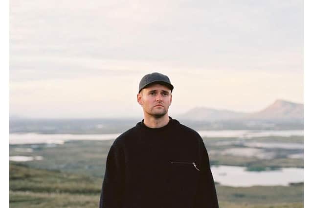
This new business is based on Uist, and run by father and son team, Angus E and Angus A MacMillan, who also own Benbecula Distillery, which will be opening on its eponymous Outer Hebridean island this Spring.
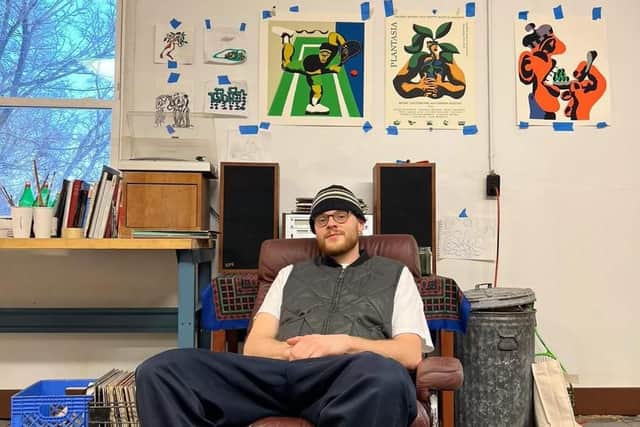
They commissioned Scottish agency, Fed and Watered, and Minneapolis-based illustrator and painter, Nick Dahlen, who came up with striking labels for their inaugural collection of eight-year-old single cask single malt Wheelhouse Whisky, as well as Machair Gin, which contains botanicals including locally harvested angelica, and Molucca Rum.
Dahlen’s final images, on the side of simple glass bottles, are punchy and joyful.
The golden rum pays tribute to the husk-like molucca beans, or sea hearts, that drift from the Caribbean and wash up on Hebridean beaches.
We imagine that, on a shelf of understated packaging, these bottles are going to be the ones to stand out, with their abstract images that are reminiscent of the work of Kandinsky, Fifties jazz album sleeves and the titchy-headed figures of Robert Crumb. We found out more about the design process.
Why did you choose Nick Dahlen to create the labels?
Oliver Hilliker, Founder of Fed and Watered: “Angus and I both loved Nick’s natural and organic style. We wanted to move away from a more formal/traditional artist and create something fresh. It was an easy choice, as our creative vision was fully aligned”.
Nick, were you surprised to receive the commission from Scotland?
Advertisement
Hide AdAdvertisement
Hide AdNick Dahlen: “I absolutely love getting new commissions from businesses all around the world, especially from countries that I’ve never worked with before. Scotland is such an interesting country so I couldn’t help but jump at the chance to work with MacMillan”.
Are you a whisky fan?
Nick Dahlen: “Absolutely! I'm a big whisky fan. Everyone here knows the amazing quality of Scotch whisky so getting to work with a company from a beautiful Scottish island was a dream of mine. I’m afraid I haven’t been yet, but I’ll have to make a trip across to Uist at some point”.
Does each of the four labels have a story?
Oliver Hilliker: “We worked very closely with Nick to ensure the history and heritage of the islands were shining through in the designs. Each one of the designs puts the people and making process behind the spirits at the forefront, from the foraging of wild botanicals in the Machair Gin to the Caribbean sugar cane and molasses in the Molucca Rum”.
Nick Dahlen: “I have my own process of research when it comes to my design work. I love to get completely immersed in a project, finding out about the history, the heritage and the people behind the brand to make sure I’m able to do the design justice. Oliver and I worked closely together to ensure I had everything I needed on the product, its ingredients, and its significance to the land”.
Which is your favourite?
Nick Dahlen: “I love all three, but I have to say my favourite is the design on the Machair Gin bottle. I found the wild angelica plant very interesting so I wanted to make something striking and unique with this one, and I just love big hands holding things”.
Did you research other spirit labels before creating your designs?
Nick Dahlen: “No, I tried to stay clear of doing this. I really wanted to create something fresh and new. I think sometimes spirit designs are there to fit in with the current status quo of the industry so I wanted to push the boundaries”.
Oliver Hilliker: “The intention was always to go with a unique design, and something that was going to stand out from the other brands. There is a lot of derivative design in Scottish spirit brands and it ends up all looking the same. So it was imperative for us, and the team, to shake things up”.
Advertisement
Hide AdAdvertisement
Hide AdThere seems to be a trend towards very plain labels, do you think that might be changing?
Oliver Hilliker: “It is always a balance between having a clean minimal design that lets the artwork sing, while also having personality and being recognisable. We find that lots of labels are cluttered with unnecessary information or fake details to invent false heritage or authenticity, which is about as unauthentic as it gets. Just like tasting a good whisky, you should feel something when looking at the labels”.
Nick, is food, drink and eating a big inspiration for your work generally?
Nick Dahlen: “I would say so, absolutely. I like to cook at home and be as creative as I can. You must find enjoyment in learning about different things, and I think this translates across to other aspects of your life too. Food, drink, and eating are such fun areas to play around with so it’s hard not to be inspired by them. I think if you have a general enjoyment for life and experiencing new things, you’ll find this helps you in whatever work you do”.
For more information, see www.macmillanspirits.com
Follow Nick Dahlen on Instagram @nickdahlen_
Comments
Want to join the conversation? Please or to comment on this article.