Art reviews: Susie Leiper at Open Eye | 21st Century Women at Compass


Susie Leiper: Library (www.openeyegallery.co.uk) ****
21st Century Women (www.compassgallery.co.uk) ****
If you happen to have an RBS fiver in your purse or pocket, you will see that there are two lines of Gaelic poetry written between the swimming mackerel that are the principal motif on the back of the note. The poetry is by Sorely MacLean (you will find a translation into English if you hold the note up to the light) and it is written in a beautiful script called Scottish Secretary. The calligrapher who wrote this lovely hand is Susie Leiper, one of 27 artists who contributed to this remarkable piece of currency. Indeed, its beauty quite out weights the fact that it was one of the first (horrible) plastic notes. Leiper’s work is so distinguished that she was also one of a small group of calligraphers who between 1999 and 2011 worked as a team to produce the St John’s Bible. It is claimed to be the only complete illuminated bible written entirely by scribes in pen and ink since the invention of printing and it must certainly be the most elaborate. In Scotland, however, apart from bank notes, Leiper is best known for the exquisite artists’ books and larger works to hang on the wall that she shows regularly in the major art society exhibitions. She also writes on walls, both for temporary exhibitions and for permanent installations and hitherto all her works, large or small, generally carry texts. When they do, these are likely to be from The Living Mountain, Nan Shepherd’s great prose poem of the Cairngorms. Indeed, Shepherd has been a major influence on Leiper’s work. This influence has not led her to paint landscapes in any simple sense, however, but the metaphysical mood her work conveys often suggests the scale and mystery of the mountains. It was only fitting therefore that the portrait on the RBS fiver should be of Shepherd.
However, in her exhibition Library, currently on the Open Eye Gallery’s website, Leiper eschews words and, on the whole, even individual letters – or, at least, when they do appear, both words and letters are either fragmentary, or in a work called Counterculture they look like text but are not. They are illegible. There are also pieces of found writing in her show. A bit of printed text reads “St John’s Road,” for instance, a serendipitous reference to the titular saint of the St John’s Bible and to St John’s University in Minnesota that commissioned it. Fragments of old-fashioned, clerk’s copperplate writing also appear in Extract and in the artist’s book Parishes Dwindle. These are bits of 19th-century legal documents. The artist found a cache of them and as none of them had any possible modern relevance, there was no crime in cutting them up. Indeed, they were written on vellum, usually prepared calf-skin. This was the calligrapher’s traditional material and to any calligrapher these documents would represent a valuable resource. It is also actually traditional to reuse it. It has even given us the word “palimpsest” – what happens when the old text is legible beneath when a piece of vellum has been reused.
Advertisement
Hide AdParadoxically, however, although a quarter of the 60 or so works in the show use vellum as their principal support, none demonstrates the artist’s calligraphic skills. This show is called Library and of course, although any library contains words in their millions, closed books conceal their contents. The artist told me how she came to calligraphy from books and how in a way this show reflects on that journey. After graduating from university she worked in publishing as a book editor. She had loved writing since she was a child. Indeed, she says she was copying letters before she could read the words they spelt. It was natural that when she got the chance she should study calligraphy in Hong Kong. There she learnt some of the ancient skills of the great art of Chinese calligraphy. In both China and Japan, however, calligraphy is inseparable from the art of painting and so she brought back to Western calligraphy the multifaceted skill that before printing had produced the long history of the illuminated book.
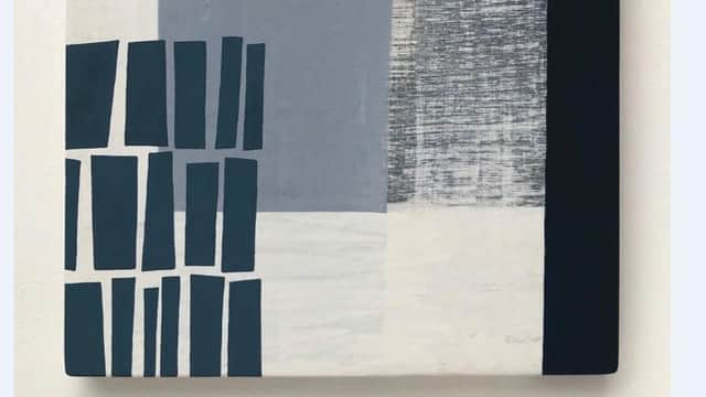
Most of the works in her present show are book-size. They could be in a library, but one or two are much bigger. Counterculture and Architecture of Disruption, for instance, are both six feet across. Most also have some library reference in their titles, like Special Collections, for instance, Stacks, or Editions, or indeed also in their imagery. Rectangular shapes in Shelving I and II and Shelf upon Shelf suggest books loosely shelved, but in Lost Work these suggestive shapes shade off into a mist of unknowing. Undocumented I, II, III and IV is a series of works that really are like palimpsests. They are each made up of sheets with script partly erased or showing through the thin vellum as mirror writing. MS495 is similar, a beautiful surface of rubbed white and grey with a hint of written text showing through. As always with Leiper’s work, the overall impression is one of poetry, not inappropriate to a library, and of exquisite delicacy in the making.
Compass in Glasgow has a long and distinguished history of creating opportunities for artists and there have been many women among them. A show at the Backdoor Gallery in Clydebank brought together a dozen or more of the women Compass has promoted including around 30 of their works. Like every other, this show has been closed by the present crisis. Happily, however, it is available on the Compass website.
There are several striking works by Lys Hansen. Going Back is an evocative street scene by Helen Wilson. Portrait of a Young Woman by the same artist is a touchingly sensitive image. The Leeks, they are drowning is a remarkable painting of a flooded field and destroyed harvest by Anns Geerdes. End of the Road by the same artist, dead stalks of corn in a field, seems to present an equally bleak vision of the world. Two paintings of evening skies by Marie Barbour are very beautiful. There is much else too, but one slight drawback of this show online is that when you go to the large image, you lose sight of the artist’s name. In consequence you can’t simply scroll through the large pictures and also keep track of what you are looking at. Still, the show as a whole is a reminder of what a terrific job Compass has done since it opened in 1969 and of course, saying that, I do not forget what the Open Eye, too, has done for us over almost as long a time.