Art reviews: RSW Open | David Evans | Adrian Wiszniewski
143rd Open Annual Exhibition of the RSW, Royal Scottish Academy, Edinburgh ****
David Evans, Open Eye Gallery, Edinburgh ****
Adrian Wiszniewski: Science and Art, Open Eye Gallery, Edinburgh ****
Advertisement
Hide AdGenerally we value and admire skill wherever we find it, but sometimes, it seems, not so much in art. There, skill, or at least any obvious display of it, can seem meretricious and a barrier between us and some kind of truth or sincerity. These reflections are prompted by the 143rd Open Annual Exhibition of the RSW, the Royal Scottish Society of Painters in Watercolour.
Watercolour may look easy – it is the preferred medium of the amateur after all – but to realise its subtle beauties requires real skill and so this exhibition is a place where skill is much on display. Feeling that a show limited to just one medium was too exclusive, however, for some time now the RSW annual has been open to works in any water-based medium. Principally that means acrylic which is water-based, but, a bit of chameleon, it can emulate both the transparency of watercolour and the density of oil paint.
Nevertheless, it is still true watercolour that catches the eye here and gives the exhibition its distinctive character. Challengingly, too, the annual January display of Turner watercolours is on in an adjacent gallery. Turner’s skill with the medium is astonishing, but tellingly it is always a means to an end, never an end in itself and that gives us a yardstick looking at the contemporary paintings in the same medium in the galleries nearby.
There are certainly some works among nearly 400 on show where technical wizardry outranks sensibility, but there are plenty of others where real skill is the vehicle for something much more valuable. Take Lisa O’Brien’s Coile Badan Mhuagaidh, October, for instance. Executed in ink and wash, both cool grey and warm sepia, it is a free and lively drawing of pines against a misty background. The paper is mounted to show its deckled edges making it a very satisfying object. There is similar freedom on a bigger scale but with the same limited means in a big semi-abstract painting called Winter by Susan Macintosh. Here again the freedom she has granted her medium gives it real subtlety. The paper matters here too, a big sheet hanging free and unframed, it is not just a passive support, but is a key part of the image. In the Balance by Sheila Anderson Hardy is another big sheet of free-hanging paper. A lovely painting of a bramble bush inhabited by birds and butterflies, it is a very different kind of image, but although there is a lot of delicate detail, you can see how it has been built up against the freedom of the initial lay-in and this gives the whole painting real delicacy of feeling. Darren Woodhead’s Grasshopper Warbler Pair and Apple Blossom is executed in a similar way, but with a compositional sweep and an expanse of white paper reminiscent of Japanese painting.
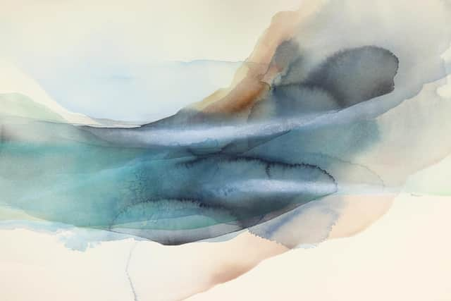

Claire Harkess’s beautiful Chaffinch and Stachys Byzantina shows a similar inspiration – so much so that the freedom with which she paints melds seamlessly with grassy fragments in the weave of the Japanese paper that she uses. Into the Blue by Peter Henery is handled in a similar way, but fish and the sea have replaced birds and sky. In Nature Embrace, Pascale Rentsch has used loose washes and splashed paint to create an image that suggests, but scarcely describes flowers and foliage. Peter Davis uses washes with even greater freedom, just veils of colour, but to beautiful effect. (Davis is showing concurrently at the Birch Tree Gallery on Edinburgh’s Dundas Street.) Alison Dunlop’s sweep of transparent blue in Minch Skyfall is similar. Working in monochrome in Breaker Zone, Marian Leven uses the most minimal means, just two simple blocks of grey washes, but their transparency and texture create a quietly satisfying image.
These pictures demonstrate how watercolour at its best is a four-way dialogue between artist, image, medium and paper. Indeed paper is often key because transparency is the special gift of watercolour and so we see at once both paint and paper. Angus McEwan’s Bucket Full of Shadows, for instance, is a beautiful still-life, meticulously painted. The light of the paper shining beneath transparent paint contrasts with passages of nearly opaque black gives it a beautiful luminosity. In the same way, in It did not matter who was listening, Alice McMurrough fills a room with light as a girl, passionately playing the piano, seems lost in her music. In a more complex image titled Three Sisters, Kate Bentley contrasts loose washes of shifting colour with passages of greater detail to create an intriguing surreal interior.
Advertisement
Hide AdAmong so many pictures naturally there are good many that use the denser medium of acrylic or indeed that mix media, too. It is not always easy to tell, but Ian Cook’s enormous Night of the Marionettes, a dramatic mix of figurative and abstract imagery, would seem to be an impossible achievement in pure watercolour. So too would Ian Ritchie’s haunting portrait, Southern Gothic. The convincingly gooey image of James McDonald’s Toast and Jam likewise has more texture than transparency, while Michael Durning’s impressive Le Paquebot depends for its dramatic effect on contrasts of transparency and solid colour. There is much more too of course, although with so many works on show, while the main galleries feel spacious there is inevitably some of what, in the bad old-days of frame to frame hanging, artists used to call “skying” – pictures hung too high to be seen. There are a lot of prizes and awards, but my choice for prize would be In The Circus Journal by Ann Ross – watercolour and layers of collage create a wonderfully layered and delicate poetic image.
The Open Eye is currently showing work by David Evans and Adrian Wiszniewski. Evans died two years ago and so the show serves as memorial to a fascinating artist. Light is crucial to the strange mood in his paintings of deserted streets and enigmatic, often shuttered buildings. In a picture like Central Supply, where the sun casts a sharp shadow across a shut up industrial building, time seems suspended in haunting stillness in a way that is reminiscent of de Chirico. In House II, the light in two dormer windows shines in darkness, reminding us in the same way of Magritte, but really the quietly surreal poetry in Evans’s work was his own.
Advertisement
Hide AdAdrian Wiszniewski’s work is poetic too, but in a very different register. There are very few figures in Evans’s work, but here figures fill the pictures. In contrast to Evans’s moody, shadowy depths too, with Wiszniewski colour and pattern are very much on the surface, but he draws beautifully. The faces of the young people who inhabit his compositions singly, in pairs, or in groups brought together by some often mysterious activity, have the remote stillness of classical sculpture. His pictures have a powerful presence, but always remain enigmatic, and that is their enduring appeal.
RSA Open until 6 February; David Evans and Adrian Wiszniewski RSA until 3 February