Theatre review: The Persistence of Type, Glasgow


The Persistence of Type - Tramway, Glasgow
* * *
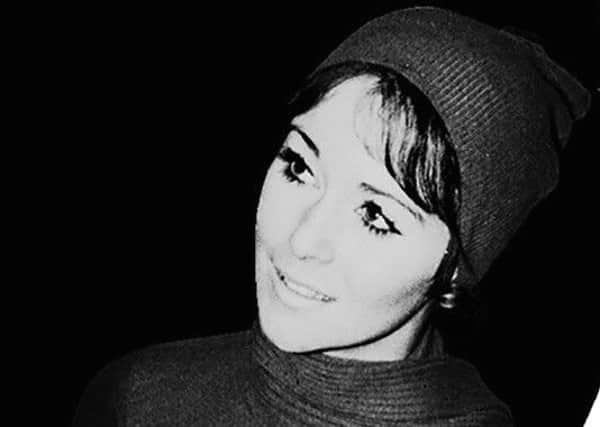
But the story goes that when model Ann Johansen was pictured loitering fetchingly in the Scottish shrubbery, the brewer’s postbag went wild. Ann became the star attraction on the tin. On her retirement a few years later a new generation, the Lager Lovelies, came in her wake featuring ever-larger bouffant hairstyles in inverse proportion to their ever-decreasing clothes.
The joy of the Persistence of Type, a new collaborative exhibition commissioned by curators Panel from artist Fiona Jardine and the excellent designers Maeve Redmond and Sophie Dyer, is that while the show harvests this rich social history through some key Scottish source material, it never succumbs to self-serving legend. Instead it explores – through a clutch of screenprints, a digital film and an erudite printed essay by Jardine – the notion of type and types.
Advertisement
Hide AdFor these women were types, not individuals. Known by their first names only, they were blondes or brunettes. They were descended in a way from the modern stenographer with shingled hair of the 1920s, the office girls and saucy secretaries of the 1950s.
By the time of the first lager lovelies, the air hostess was the aspirational figure who apparently inspired the modern woman. Or at least, as the exhibition sets out to explore through playful allusion rather than stern lecture, that’s what the men who wrote and received advertising copy would have us believe. Jardine is sharp and hilarious on the times: the Fly Me campaign of the US National Airlines aped by the minnow British Caledonian Airways under the strapline “she goes further than you think”.
There’s not too much to see in the show, but a lot to read and think about, and a clutch of bold screen prints crafted from archive material including that of design agency Forth Studios, set amid fantastic airport departure lounge furniture designed by Steff Norwood. It will pay host to a talk next month by Jardine on the soft focus aesthetic of the era.
In one corner, three screens show not arrivals and departures but a slyly funny recitation of text, showing the intrinsic link between typography and type; between inking and thinking.
• Until 9 August